Strategic Checkout Audit
UX Consultant | Ecommerce Brands
• Checkout Optimization • Data-Driven Recommendations • Heuristic Evaluation • Information Architecture • Quantitative & Qualitative Research • User Flow Optimization
• Checkout Optimization • Data-Driven Recommendations • Heuristic Evaluation • Information Architecture • Quantitative & Qualitative Research • User Flow Optimization
• User Behavior Analysis • Conversion Rate Improvement • Mobile-First Approach • Design Documentation • Usability Evaluation • Prioritization Framework • User Guidance
• User Behavior Analysis • Conversion Rate Improvement • Mobile-First Approach • Design Documentation • Usability Evaluation • Prioritization Framework • User Guidance
1. Situation
• Market & user context
• Engagement scope & goals
2. Complication
• Top UX frictions in checkout
• Business & user impact
3. Question
• Core UX challenge to solve
4. Answer
• Audit approach & methodology
• Key findings & hypotheses
5. Next Steps
• Prioritization score & matrix
• Roadmap & contact

Agenda:
How This Audit Is Structured
Situation:
Market & User Context
The checkout experience is the final barrier between browsing and revenue. Industry data shows that:
• Average cart abandonment: ~70 % (Baymard Institute)
• Mobile sessions: ~60 % of total ecommerce traffic
• Fashion shoppers expect speed, clarity, and brand consistency
🔷 Context
A leading kids & family e-commerce retailer (anonymized) faced high checkout abandonment. Mobile users — 60% of traffic — reported frustration with unclear steps and hidden options.
The client suspected usability frictions but lacked a detailed UX analysis.
🔷 My Role
• UX Consultant (Audit‑only)
• 1‑week engagement
• Delivered: Heuristic review, friction analysis, actionable recommendations
Complication:
UX Frictions Overview

#1: Guest‑checkout option hidden under shipping form
The "Continue as guest" option lacks visibility and clear purpose. Users may not recognize it as an actionable element, and its connection to the form fields below isn't obvious.

#2: Step indicator mixes sign‑in and address entry
Essential checkout steps are compressed under just "shipping" and "payment" categories. The step indicator lacks clear login or order confirmation markers. Sign-in button is inappropriately placed under the shipping address heading, creating confusion between two separate processes that should be distinct.

#3: No persistent order summary; users lose cost visibility
Mobile users cannot review their selected items or adjust quantities within the checkout flow. Customers must exit the checkout process entirely and return to the shopping cart to make any changes, creating unnecessary friction and potential abandonment.

#4: Too many mandatory form fields slow users down
The checkout requires birthday information without explaining why this personal data is necessary. This creates potential trust issues for privacy-conscious customers and those seeking a quick purchase experience.

Question:
Core UX Challenge
How might we cut abandonment by ≥ 10% and boost user confidence through:
Clearly exposing guest-checkout
Maintaining a transparent order overview
Streamlining data entry ?
Answer:
Audit Approach

I.Heuristic Evaluation
Applied 5 core UX heuristics: visibility of system status, error prevention, consistency, user control, and feedback.

II. Competitor Benchmarking
Analyzed multi-step flows of 10+ kids & family e-commerce retailers for step labeling, summary placement, and form design.

III. Prioritization Modeling
Scored each finding on User Impact vs. Implementation Effort to guide stakeholder roadmaps.
Answer:
Key UX Frictions & Recommendations

Friction #1: Guest‑checkout buried in shipping step
-
The “Continue as guest” CTA was placed in the address section, making it practically invisible to first-time users.
Also, when users click on "Sign-In", they're redirected to a separate page, disrupting checkout. Return path is unclear - users must find their cart first, then locate the "Go to checkout" button to continue.
-
Guest checkout is a low‑commitment path that reduces friction—hiding it increases drop-off.
-
Move the guest checkout option to a standalone modal or to the top of Step 1, making it immediately visible. Use strong contrast and concise language to encourage quick user decisions.
Offer a clear sign-in/guest choice immediately after clicking "Proceed to Checkout" button. Offer fast sign-up options through social accounts like Facebook or Apple to reduce friction.
Weighted score:
(User Impact 4 × 50%) + (Effort 3 × 50%) = 3.5

Friction #2: Confusing step indicator
-
The progress bar mixed “Sign‑in” with “Shipping” under one label, confusing users about task scope.
There is also no "Confirm Order" step in the progress indicator, which is crucial for reinforcing user trust and creating a sense of control before completing the purchase.
-
Without clear step labels, users lose orientation and may abandon when they think they’ve missed something.
-
Separate step labels into distinct phases: Account/Guest → Shipping → Payment Method → Review & Place Order. Make prior steps clickable.
Weighted score:
(User Impact 4 × 50%) + (Effort 3 × 50%) = 3.5

Friction #3: No persistent order summary
-
Users lost sight of order totals once they scrolled past the summary box—no sticky panel.
On mobile, users also cannot view their order summary or adjust item quantities during checkout without navigating back to the shopping cart.
-
Hidden totals lead to last‑minute surprises and distrust, raising cart abandonment.
-
Implement a sticky, collapsible sidebar or header panel showing item list, subtotal, shipping, and taxes.
Weighted score:
(User Impact 4 × 50%) + (Effort 2 × 50%) = 3.0

Friction #4: Excessive mandatory fields
-
Fields like “Birthday” and “Title” were required, though irrelevant to purchase completion.
-
Every extra required field adds seconds and frustration, especially on mobile.
-
Reduce to essentials: Name, Address, Payment Method. Move supplementary fields to post‑purchase or optional profiles.
Weighted score:
(User Impact 5 × 50%) + (Effort 3 × 50%) = 4.0

Friction #5: Unclear CTA hierarchy
-
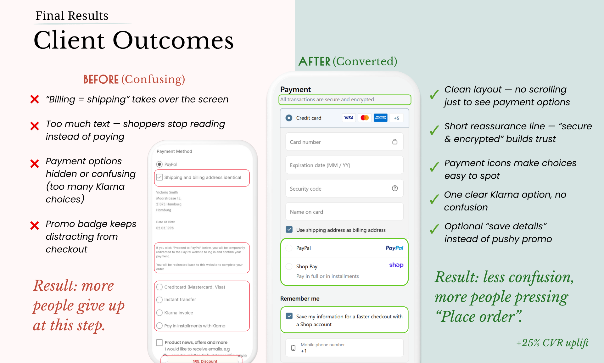
“Apply Discount” and “Place Order” (here - Continue to PayPal) buttons had equal prominence, diluting the primary action.
-
Users could click the wrong button or hesitate, interrupting checkout flow.
-
Demote “Apply Discount” to a secondary text link or small icon. Emphasize “Place Order” as the primary, colored button.
Weighted score:
(User Impact 5 × 50%) + (Effort 4 × 50%) = 4.5

Friction #6: Missing shipping details
-
No carrier name, logo, or delivery timeframe was displayed in shipping options.
-
Users trust known carriers and delivery estimates; absence creates doubt.
-
Add carrier icons/logos and expected delivery windows (e.g. “UPS – 3–5 business days”) next to each option.
Weighted score:
(User Impact 3 × 50%) + (Effort 4 × 50%) = 3.5
To help teams decide which UX recommendations to tackle first, I use a simple Impact × Effort matrix with weighted scoring:
How the Score is Calculated?
Each recommendation is evaluated on two key factors (50% each in this example, but weights can be adjusted based on your business priorities):
User Impact (50%): How much it improves the customer experience & conversion (scored 1-5, where 1 = minimal impact, 5 = maximum impact)
Implementation Effort (50%): How resource-intensive the change would be (reverse scored 1-5, where 1 = very large effort, 5 = minimal effort)
The final prioritization score is calculated by:
Multiplying each rating by its category weight
Adding these weighted scores together
Formula: Weighted Score = (Impact Score × Impact Weight) + (Effort Score × Effort Weight)
The higher the total score, the more beneficial the recommendation is to implement (better ROI), balancing maximum user benefit with practical resource constraints.
To guide you through recommendations, I use an Impact/Effort matrix that visualizes each UX improvement opportunity according to its potential business value. This approach guides product teams to deliver maximum value first.
Next Steps:
Prioritization Score

Next Steps:
Prioritization Matrix

Y = Impact (1 low → 5 high): How much UX and conversion improve. | X = Effort (1 low → 5 high): Development complexity.
QUADRANTS
Quick Wins (High Impact, Low Effort)
Top-right corner. These are “easy wins” that deliver big UX improvements with minimal development time—e.g. adjusting CTA hierarchy (Payment section of checkout) or exposing the guest-checkout option.Big Bets (High Impact, High Effort)
Top-left corner. High value but resource-intensive changes—e.g. implementing a sticky order summary component.Fill-ins (Low Impact, Low Effort)
Bottom-right corner. Small tweaks that are easy to do but yield limited UX gains—e.g. minor color adjustments on buttons.Money Pits (Low Impact, High Effort)
Bottom-left corner. Avoid these for now—they require significant effort but deliver little user benefit.
HOW TO READ IT & NEXT STEPS
See each recommendation by its Impact and Effort scores.
Focus first on the Quick Wins (upper-right corner).
Plan next for Big Bets when resources allow.
Reserve Fill-ins for idle development time, and defer Money Pits until larger projects are done.
This model guides product teams to deliver maximum value first.

Next Steps:
Roadmap

Conclusion & Summary
In this audit I uncovered 15 distinct UX frictions, of which the top six have been detailed here.
Implementing the Quick Wins alone can significantly reduce form completion time, boost user trust, and lower abandonment rates.
Next, these insights will feed into a design sprint or A/B testing phase — but the high‑level analysis stands on its own as an independent UX Audit deliverable.
Ready for Your Own Checkout Audit?
I help kids & family and fashion e-commerce brands uncover hidden UX issues and turn insights into prioritized roadmaps. Complete the form below to share your inquiry, and I'll get back to you shortly :)